Take a home tour through one of my favorite rooms in my house: my home office and craft room space! This bright and functional work space is full of closed storage, creative crafting zones, a digital workstation and kids art gallery. Check out the first steps in my craft room tour we completed to create this oasis for one crafty working from home mom!

Those who follow me on instagram stories know that I’ve been teasing an eventual home office and craft room tour for some time now! Every time I thought I’d be ready to shoot it, we started another project to make it even more awesome! I’m happy to report that while there are still a few things I want to do to make it the most functional space for me, it’s finally in a spot to showcase it in all it’s glory!

Let’s start at the beginning! Here’s the room from the listing photo when we bought the place followed by a photo I took upon getting the keys.

It had this weird orangish floating floor that didn’t match any other of the many flooring options throughout the house, a greige wall and skinny baseboard trim.

First step was to tear that out and replace the floors with these wide floor boards we’ve been installing throughout the rest of our first floor. (The other flooring you see here in front will eventually be tile when we do our kitchen!)

My handy hubby also painted the walls a fresh Behr Frost white and added new chunky baseboard trim, like we’re using in the rest of the house. Keeping the walls white makes for bright clean flatlay photos that I often do on the floor. If I had a colored wall, it would most likely cast color onto my pictures and be a mess to color correct every time.

Next, I started working on a plan using Ikea furniture. I cut out the exact dimension of these items we chose using recycled kraft paper from shipped packages. It really helped us visualize the space and move things around to get the exact layout we wanted.

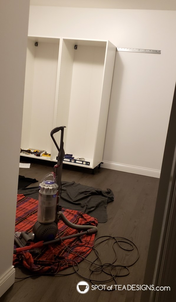
Next up, we hit Ikea! We ended up buying the high cabinet bases and only a few shelves/drawers to fit inside. I needed to start putting things into it to figure out what else would fit so a second trip was needed later for more of the “inners”.

I LOVE these large cabinets for the back wall space. They are part of the Sektion kitchen system and are really meant for pantry cabinets. They hold SO much stuff and can be heavy things at that!

I originally wanted basic white doors but Derek pushed for the upgraded Bodbyn gray door fronts and I’m glad he did.

When the office door is open, which is most of the time, you can see these door fronts from all the way down at the other end of the house. It’s nice to look at these dimensional grey fronts instead of flat white.

Come see part 2 of this craft room tour, complete with all the resources of which cabinets we bought, more workspace views, and glimpses into the insides of cabinets and drawers to see how I organize it all!


Leave a Reply