I will start off this post by saying: I AM NOT CLAIMING TO BE A BLOGGER EXPERT. I know I’m not the biggest blog or social media guru there ever was. However, I have been blogging for 3+ years now, look at tons of blogs for my work and have found some great information out there in the world of the internet. Here are six of my favorite simple tips for new bloggers that could improve their site traffic or bounce rate.
(Note: visual examples shown are for a WordPress format. Please review your FAQ section on how to accomplish these tasks, if using a different blog hosting site)
1. Make outside links open in a new window/tab.
When you add a link to an outside source on your blog and DON’T force it to open it in a new window/tab, you are encouraging a reader to leave and possibly never come back.

When adding a text link there is a little box you can click to make the link open in a new window/tab.

When uploading an image which will go to another site, add the URL on the “edit” tab. Then click on the “advanced” tab and at the very bottom you’ll find the “open link in new window” checkbox.
Using this trick will help encourage the flow of information but possibly limit people being distracted from the original source: you.
2. Add “alternative text” when uploading images.
Alternative text, or alt text, is a description of your image. It is often used when the image is populated on social media sites, like Pinterest. By adding the alt text you are stating what you want said about that image when pinned. Of course, this would be editable by the person pinning, but let’s face it, most people are lazy so you have a good chance of the pin stating what you outlined.

When uploading an image, you’ll find an field named “Alternative Text” to add your copy. I often try to include the general description, possibly a hashtag and end with spotofteadesigns.com. Adding the last part with my blog name actually creates a hyperlink in Pinterest.

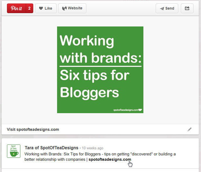
Above you’ll see the example of what happened when I pinned my own image which had alternative text. It is exactly what I had written and you’ll see that the last part of my blog name is actually a hyperlink.
4. Space out your copy.
This is actually something I learned at my first job and something I’ve used in each one since! When writing emails or large blocks of copy, use things like numbered lists, bullets or images to help break up the copy. A large block of text, especially on a glowing monitor can often exhaust a reader’s eyes and their attention. Breaking it up with these simple tactics will help keep their attention. Bonus: the images help to attract all those visual learners out there!
5. Use your full max width when it comes to images.
Are you still reading my list? Perhaps because I used a numbered list and images :)
You have chosen a blog template that has a specific width amount so use it! Bigger images catch people’s attention and also make your blog look cleaner. Note: this is the case when viewed on a desktop but often isn’t noticeable on mobile views or through sites like Bloglovin.
In October, I switched over to a new template which has a blog width of 640 pixels. The above image has been sized for my max new width. See how nice it fits?
You’ll find any new posts I had created and setup since then are at this full width, but older posts will still have the older size (until I go back and edit). The above image is one example.
Which do you prefer?
6. Watermark your images with your blog name/url.
Watermarks are a great way to claim your images in case they are used on other sites. Until recently I was manually watermarking by copying and pasting a vector design on the bottom of each image each time. That was effective, but time consuming! I knew there had to be an easier way and luckily a designer friend reminded me of the “actions” function in Photoshop to add a watermark.
Hope you found these six tips informative for your blog!


Leave a Reply